At a glance
The context, the business need, and what the solution changes.
Business context
Data Visualization
The need
Executives need to understand more than the final net income figure. They need to see how revenue, gross profit, expenses and product performance combine, how the position changes over time and which components explain the movement.
Placing every number on one screen would create noise. The design challenge was to build a clear analytical hierarchy that supports both a quick executive reading and deeper investigation.
What the solution does
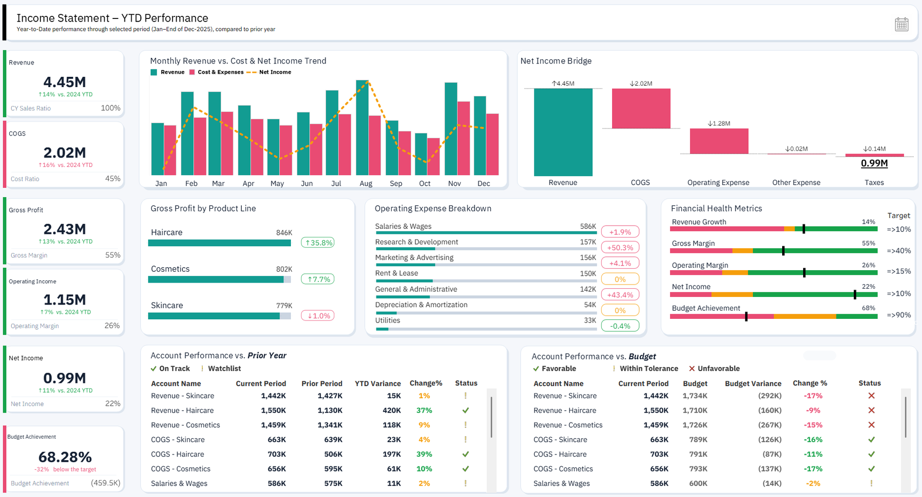
This project transforms a traditional income statement into an interactive executive dashboard. It brings the headline financial position, performance trends, net income movement, product-line contribution, operating-expense structure and financial-health signals into one coherent view designed for faster management discussion.
01
Why this needed to exist
Profit and loss statements are essential, but the standard spreadsheet or exported report often presents the numbers as a static hierarchy. It tells management what was recorded without making the movement, drivers and areas requiring attention immediately visible.
The project started from the need to preserve correct financial logic while giving decision-makers a clearer way to explore performance.
Executives need to understand more than the final net income figure. They need to see how revenue, gross profit, expenses and product performance combine, how the position changes over time and which components explain the movement.
Placing every number on one screen would create noise. The design challenge was to build a clear analytical hierarchy that supports both a quick executive reading and deeper investigation.
02
How the solution works
I organized the dashboard around the decisions a financial review should support. KPI cards establish the current position, trends show direction, the net income bridge explains movement, and the product and expense views expose the operating drivers behind the total.
Visual emphasis, comparison and grouping were used to guide attention while preserving the familiar financial statement structure.
The executive view combines financial KPI cards, trend analysis, a net income bridge, product-line performance, an operating-expense breakdown and financial-health indicators.
The components were designed as one analytical story rather than separate charts. The layout moves from the headline result to its drivers, allowing the viewer to understand the position first and then investigate what shaped it.
Supporting technologies
- Tableau
- Financial Analytics
- Data Visualization
03
What changed
The Maven case and public portfolio description document the finished dashboard and its principal analytical components: KPI cards, trends, net income bridge, product-line performance, expense breakdown and financial-health indicators.
The case supports the design and analytical capability shown. It does not support invented client outcomes, financial values or quantified improvements.
The result is a P&L experience built for decision-making rather than passive reporting. It makes the financial story easier to scan, easier to explain in a management review and easier to investigate when a figure changes.
Its demonstrated value is the combination of financial logic, analytical storytelling and professional dashboard design in one coherent executive view.